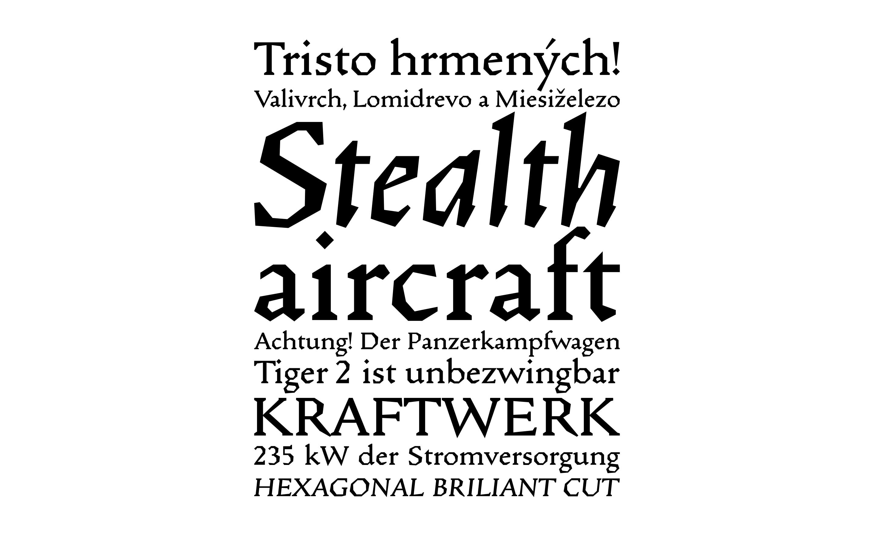
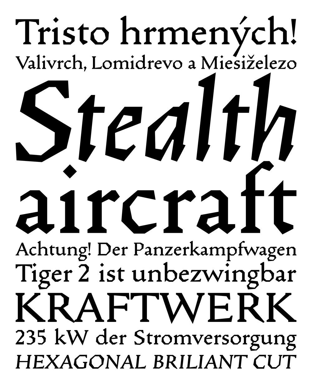
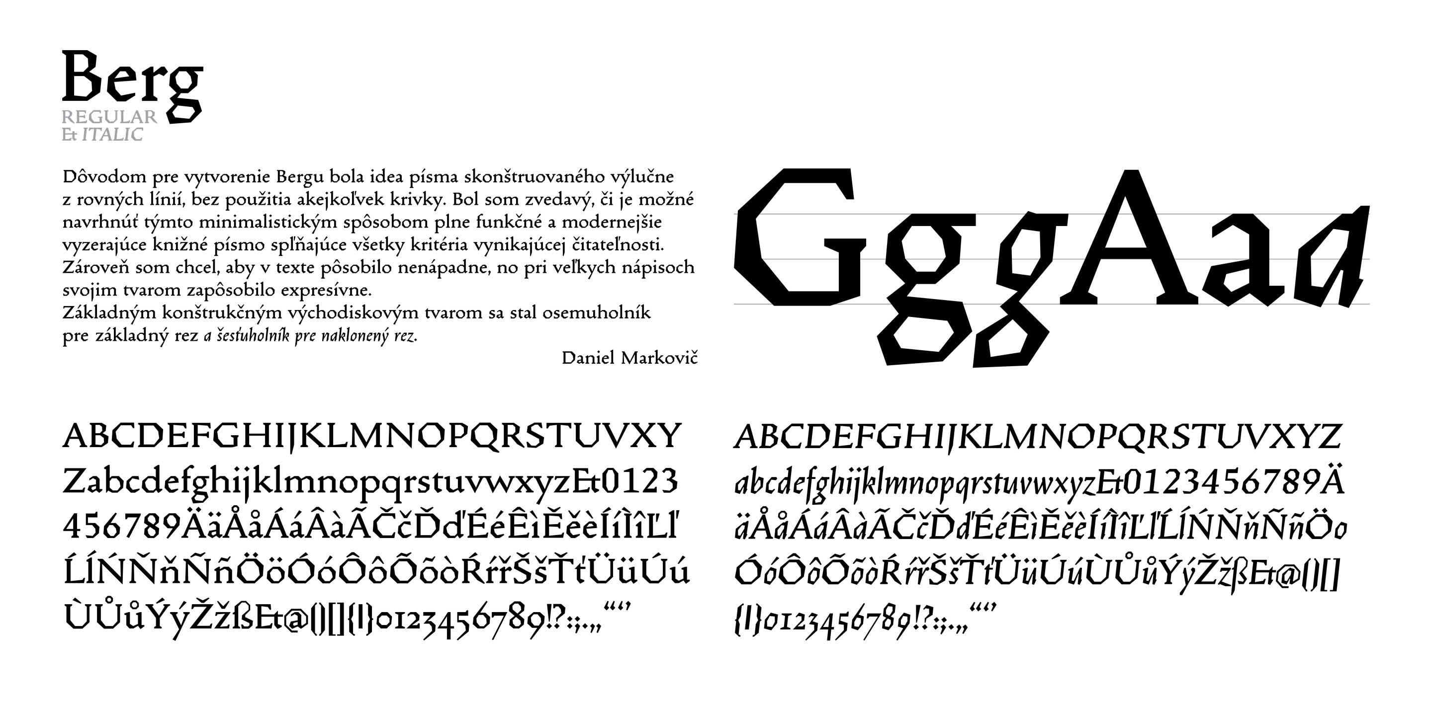
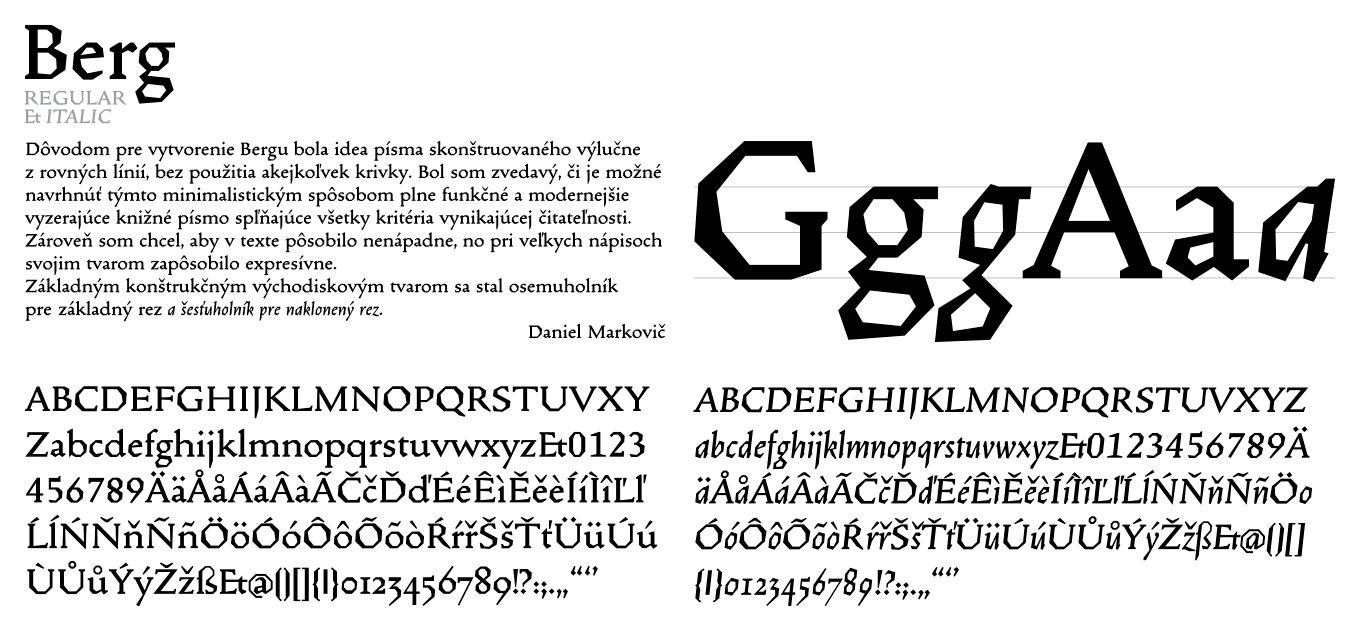
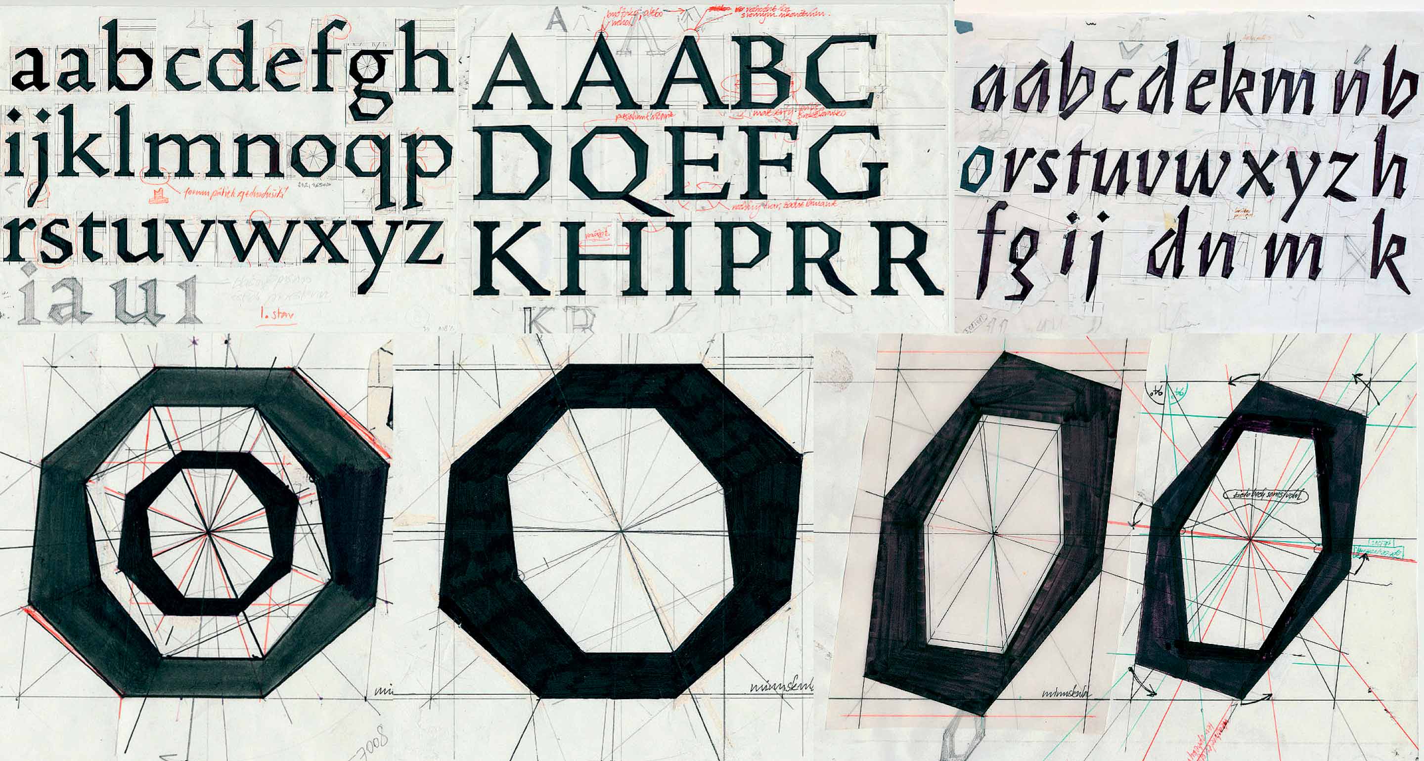
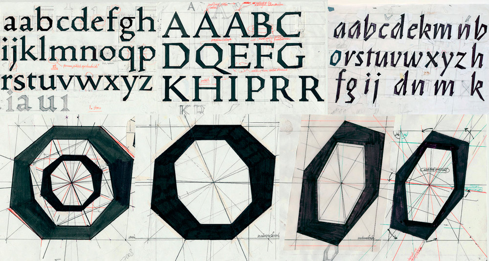
Berg – Author’s Font
The reason for its creation was the idea of a font constructed exclusively of straight lines, without the use of any curves. I was wondering if it was possible to design a fully functional and modern-looking book font in a minimalist way, meeting the criteria of excellent readability. At the same time, I wanted it to appear subtle in the text, but prominent in the captions. The octagon became the basic design starting shape for the basic cut and the hexagon for the oblique cut.
Year: 1997, 2019